


If you have just moved into your new home and want to turn your blank canvas into a personal space that reflects you, then this spring has some gorgeous colour trends to get you started. From soft neutrals to nature-inspired hues, decorating your new home will be pure joy this spring.
Pantone colour of the year – Peach Fuzz
Every year the colour-gurus at Pantone select one tone that will set the trends. This year it’s Peach Fuzz, which is exactly as soft and warming as it sounds. It’s slightly Mediterranean, but also a neutral. It’s gentle and pretty, but also quite a statement. And best of all, it’s super soothing and cosy. All of this combines to make it a great choice if you are decorating your new home. It’s a colour that is rooted in nature – there are the peaches of course, but also terracotta and clay tones, and even spring flowers.
Soft neutrals
Not a million miles away from Peach Fuzz, the soft neutrals that are trending this spring all have some warmth to their tone. Greige is, and probably always will be, a popular choice because it goes with everything and can feel warmer than grey. The setting plaster-inspired colours (again, slightly peachy in tone) are also a great way to ensure your décor feels timeless and cohesive. Use your accessories to build your décor theme. Sticking with tonal creams and natural fabrics and textures will keep you on a neutral track. If you want to vamp things up a bit though, try deep blues and greens – they will complement the softness of your base colours perfectly.
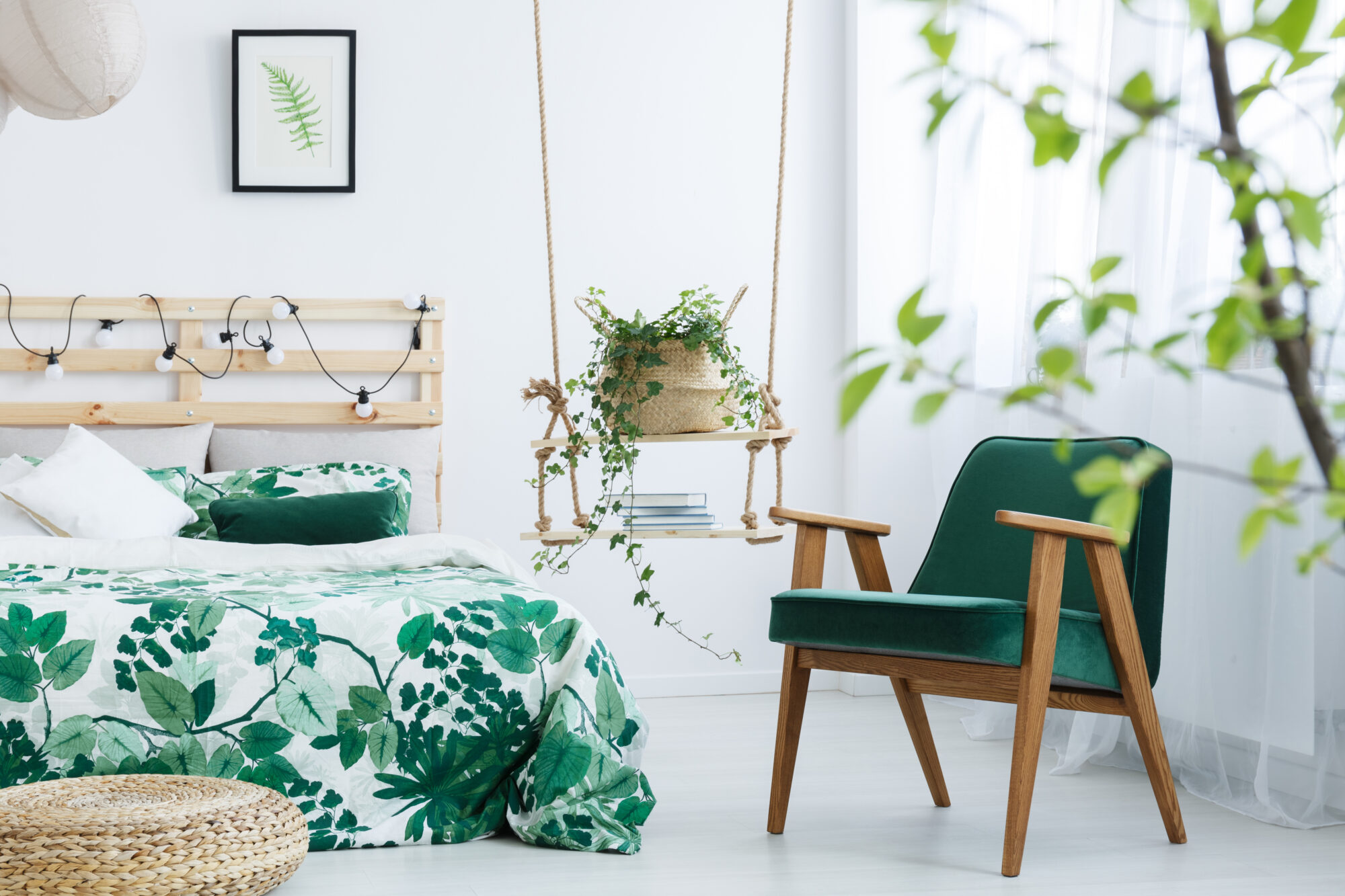
Nature-inspired
Gentle greens and pastel hues have been big both in interior décor and on the catwalks, so introducing them into your new home will ensure you are bang on trend. Think lichen, sage, and the colours of cottage garden flowers, and you will achieve the theme beautifully.
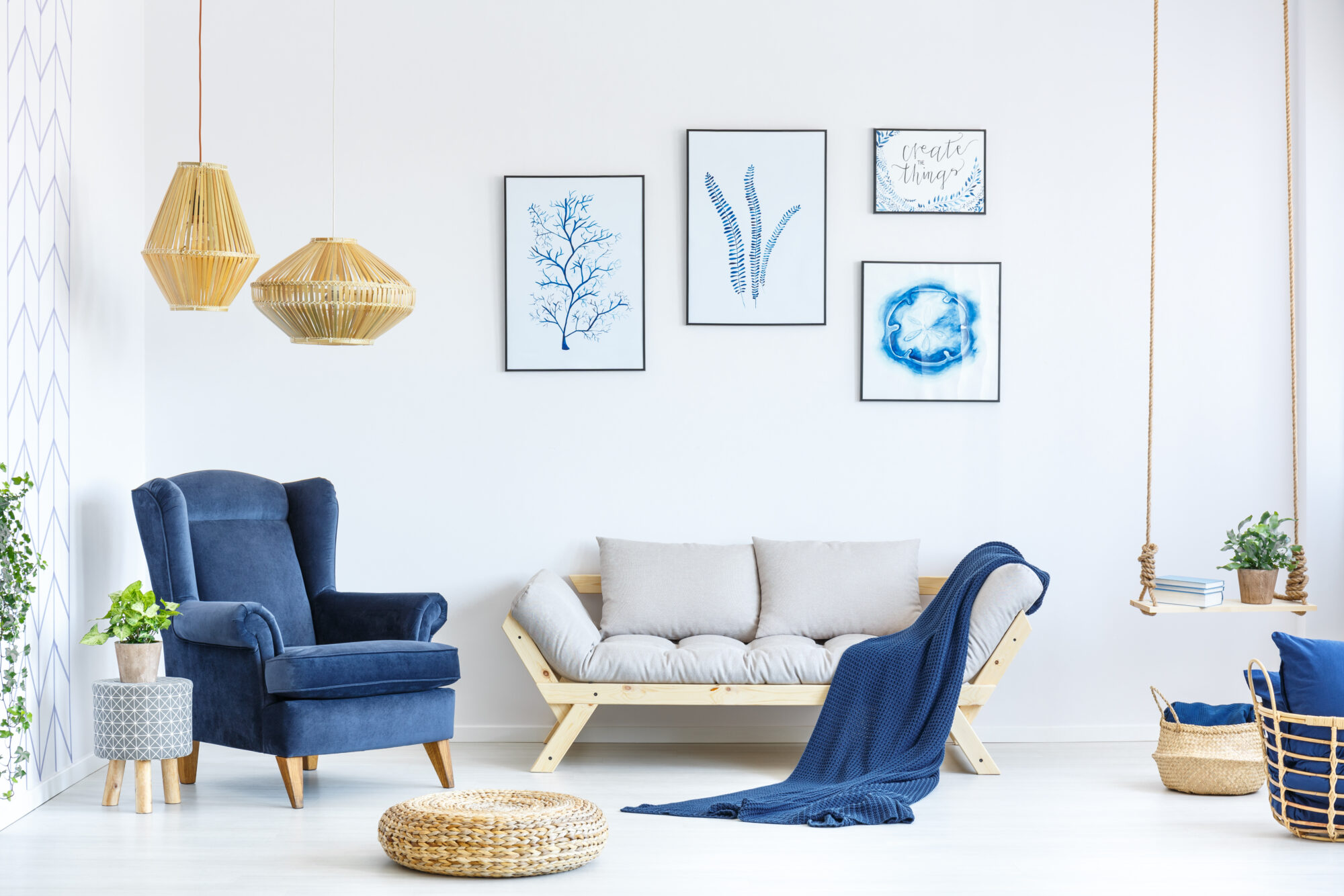
Watery colours
Staying with the nature theme, and water-inspired blues and turquoises can make a bold statement. Fresh bright shades, reminiscent of one of David Hockney’s swimming pools, can both fill a wall or act as an accent shade around skirting boards on cupboard doors. Soft furnishings are another simple way to bring in pops of watery colours. Different shades of blue and green look great alongside each other, so don’t hold back.
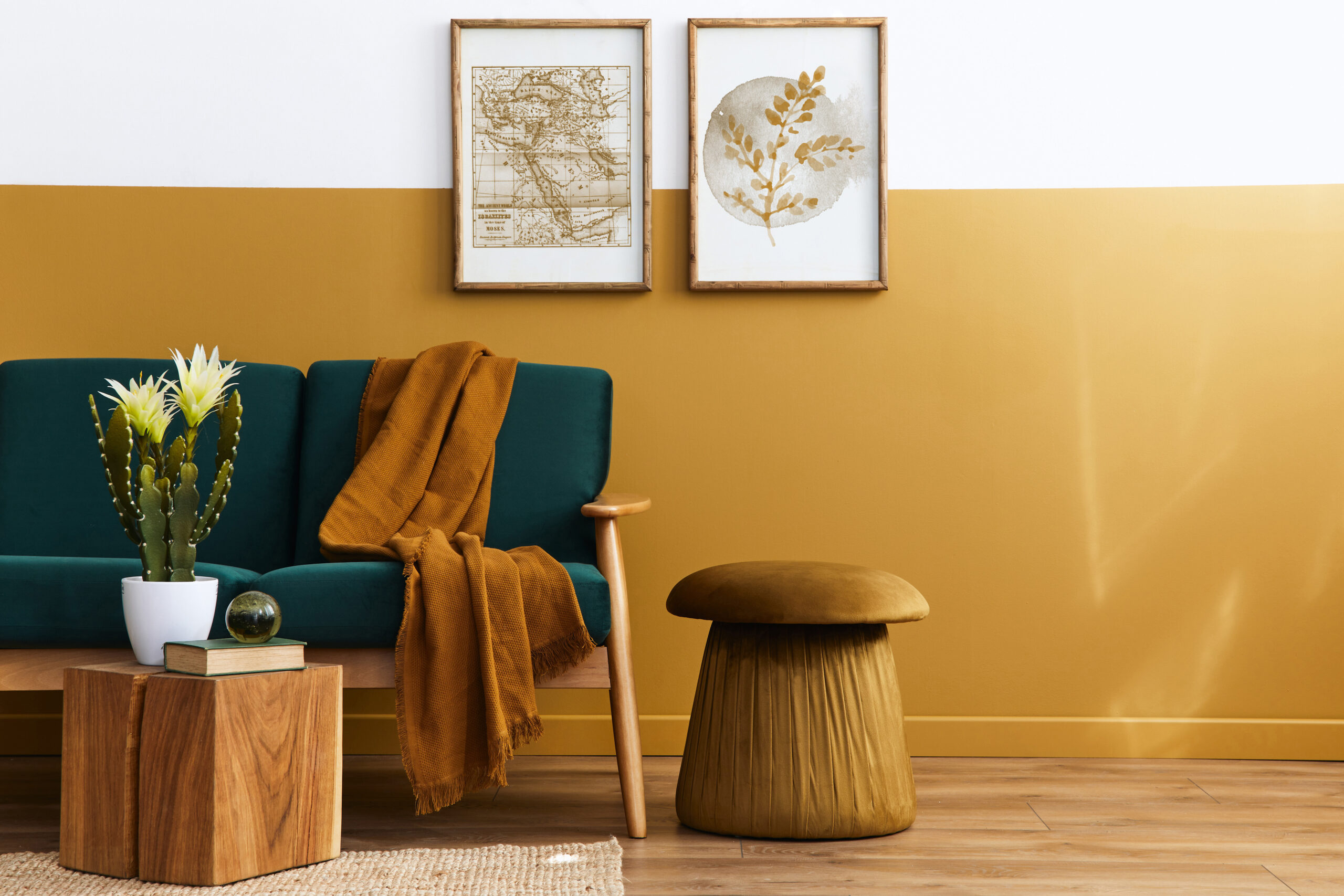
Yellow and gold
Ok, these colours feel like a bold choice together, but they can be surprisingly soothing. Opting for a mustard or ochre shade will keep your room looking sophisticated, whilst a soft primrose shade will bring country cottage vibes. Bring in the gold with your accessories. Plant pots, picture frames, coasters and cushions will all work well. If you like wall art you could opt for some Klimt prints, which would help to tie together a yellow and gold theme perfectly.
Graphic wallpaper
Patterned wallpapers have been basking in the trend spotlight for some time now, and they look set to stay there for the foreseeable. Bold prints featuring flowers, foliage, and birds can be fun and lively, either as a feature wall or across an entire room. If you fancy something a bit different though, you could try a wallpaper mural. From sprawling vistas to subtle tree canopies or sunsets, there are a range available, and they can make a beautiful and dramatic statement.
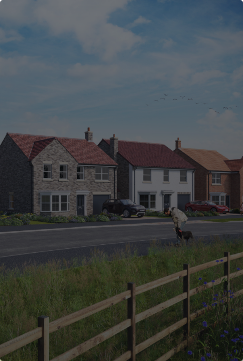
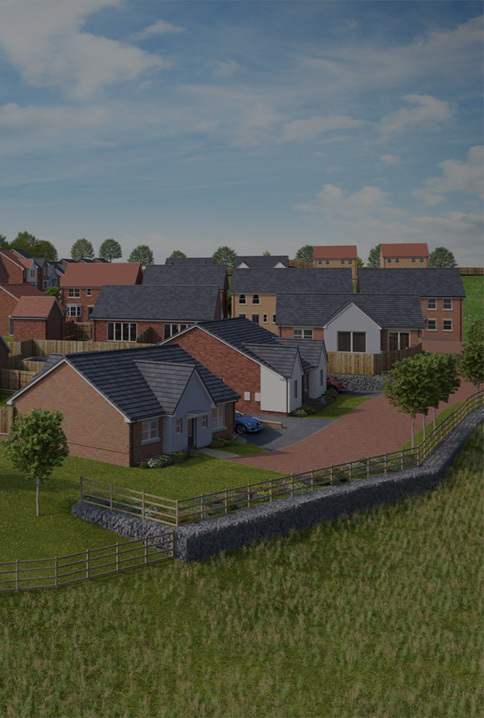
If you are currently searching for your new dream home, then take a look at our properties and book a viewing – you might find your very own blank canvas to decorate in 2024!